|
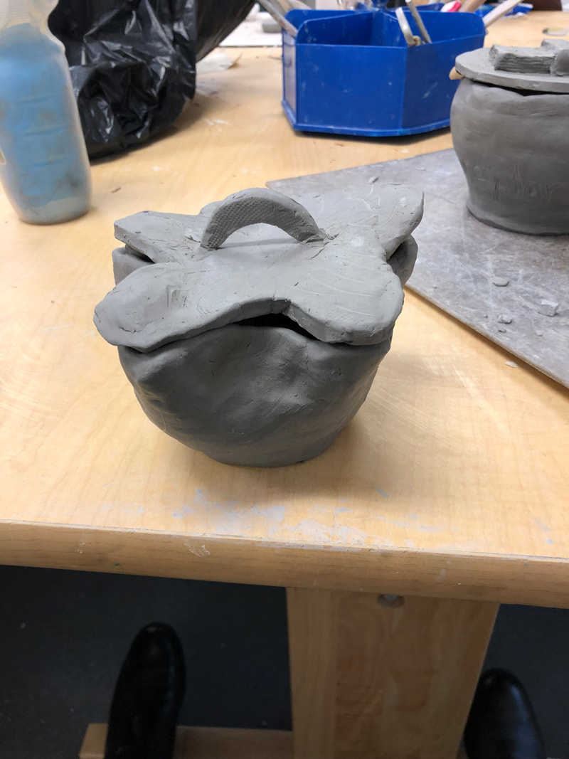
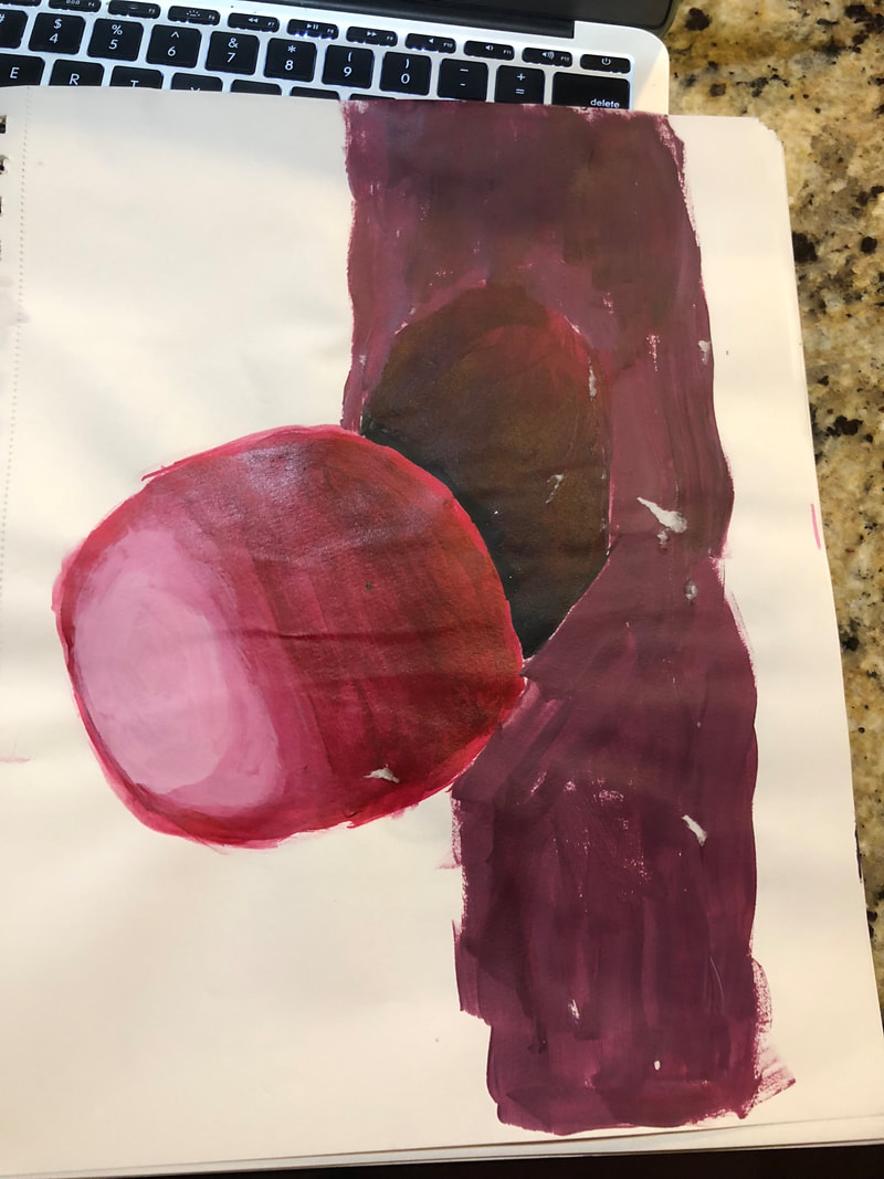
1. I plan on using it to put my car keys in it. I plan on painting it with sparkly paint in the indentions I made in the pot. I'm also going to paint the pot black and mix it with splatters of colors.
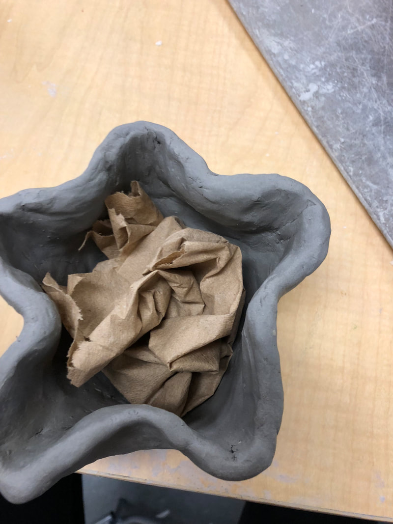
2. I found making the coils difficult, because I had to roll them out and make them thick enough so it wouldn't be too thin and break. I also thought smoothing the coils was really hard, because every time I went to smooth it the pot would get really think. I would have to keep adding clay to make it thicker. 3. I found that shaping the clay was easy to do when the clay was soft. 4. I started with a slab of clay and I cut a small circle base out. I then cut pieces out and roll them into coils. I then would scratch and slip the pieces together. I then took the greenware and smoothed it out until i got the smoothness I wanted. I formed it into a star by pinching the sides. I made a star top by tracing the pot's top. Once the pot became leather-hard I carved some indentions into like small swoops to make the pot look it'll have a stary night. Once it get's fire the first time and it is bisque I'm going to put a glaze on it before painting it.
0 Comments
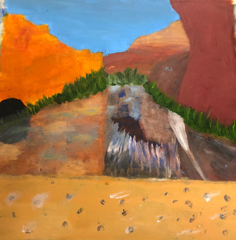
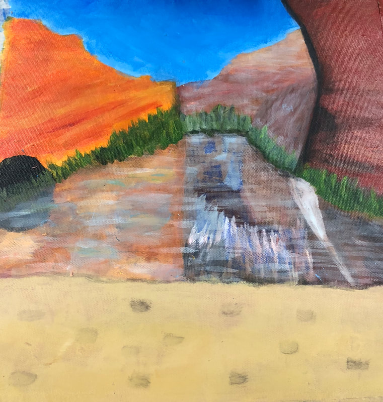
1. The place represented in my art is a cite in the Grand Canyon that my family and I camped at while on our trip. It's important to me, because it was the biggest trip I've ever done in my life.
2. The most challenging thing about my picture was making the water looking reflectant, and trying to make parts of the canyon look like it was in the distance. 3. I think the most successful part about my piece was making parts of the canyon bright with color to stand out. 4. I started with outlining the mountains and where the water would be. I started with what would be the furthest mountain. Then I worked with the mountains. I did the water, sand and sky last. I finally tried to add shadows and make the water reflectant. 1. I learned from these activities how to mix colors to get the shades that I want. I also learned how to blend colors to make a smooth transition. I also learned how to make different textures.
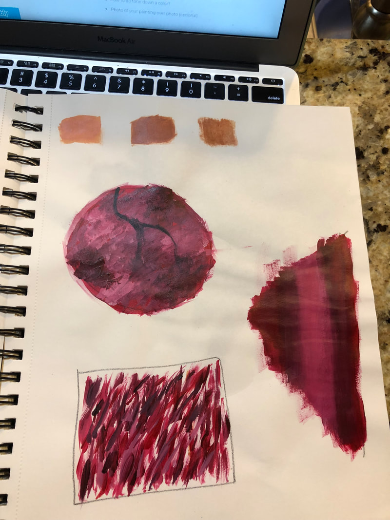
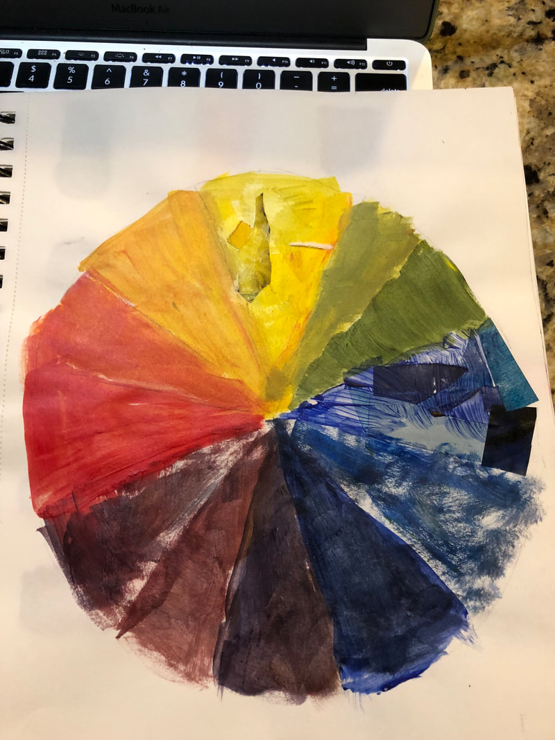
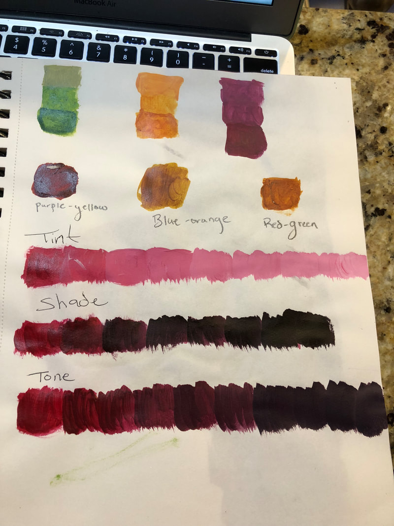
2. I feel that the rock texture and the smooth transition will be the most helpful, because I am doing a picture of the Grand Canyon, and it has water and tons of rocks in it. 3. I feel I learned the most from skin tones. It was really hard to make skin tones that would be realistic, but after learning to keep adding paint and mix till you finally have what you want. 4. You can make brown by mixing purple and yellow; blue and orange, or red and green. 5. You tone down a color by adding grey or its opposite color. 1. The sphere drawing was the most helpful, because it showed me how to blend and add value with charcoal.
2. Composition- the nature of something's ingredients the way in which a whole or mixture is made up. Value- element of design that defines the light an darks in an artwork. 3. Pen
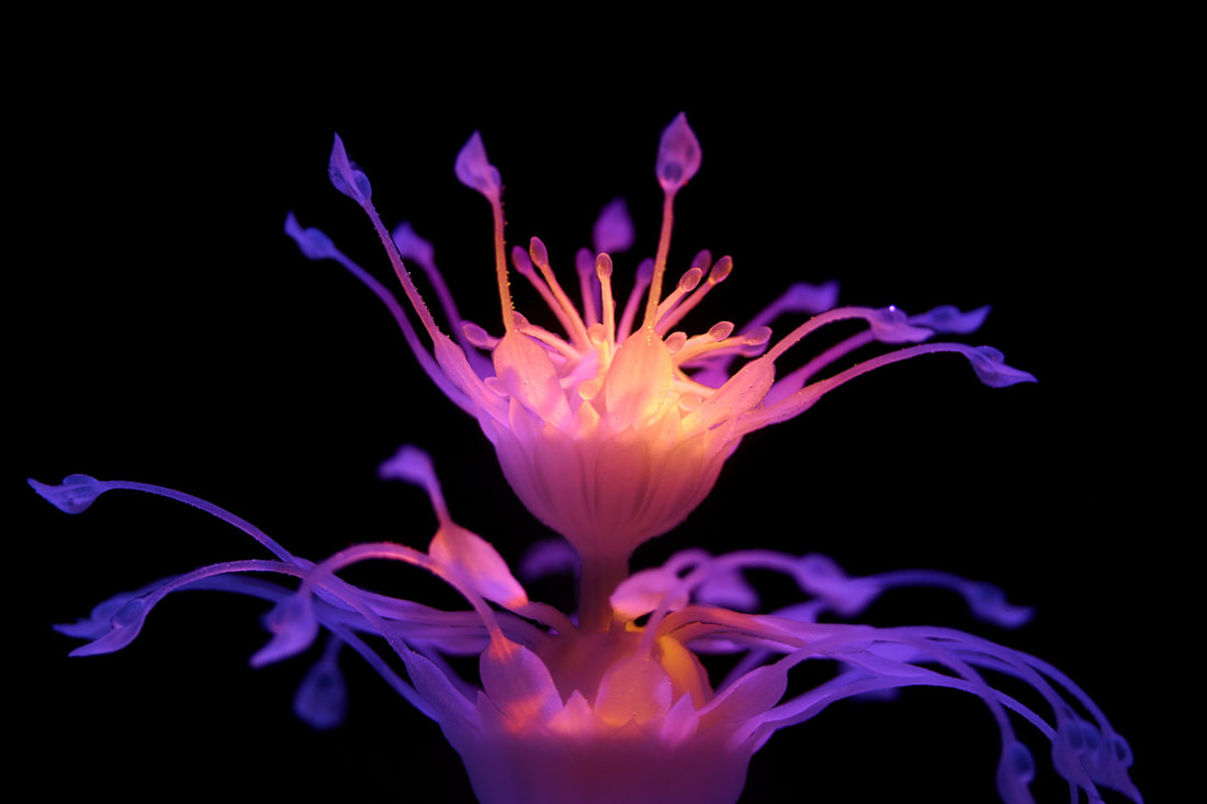
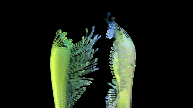
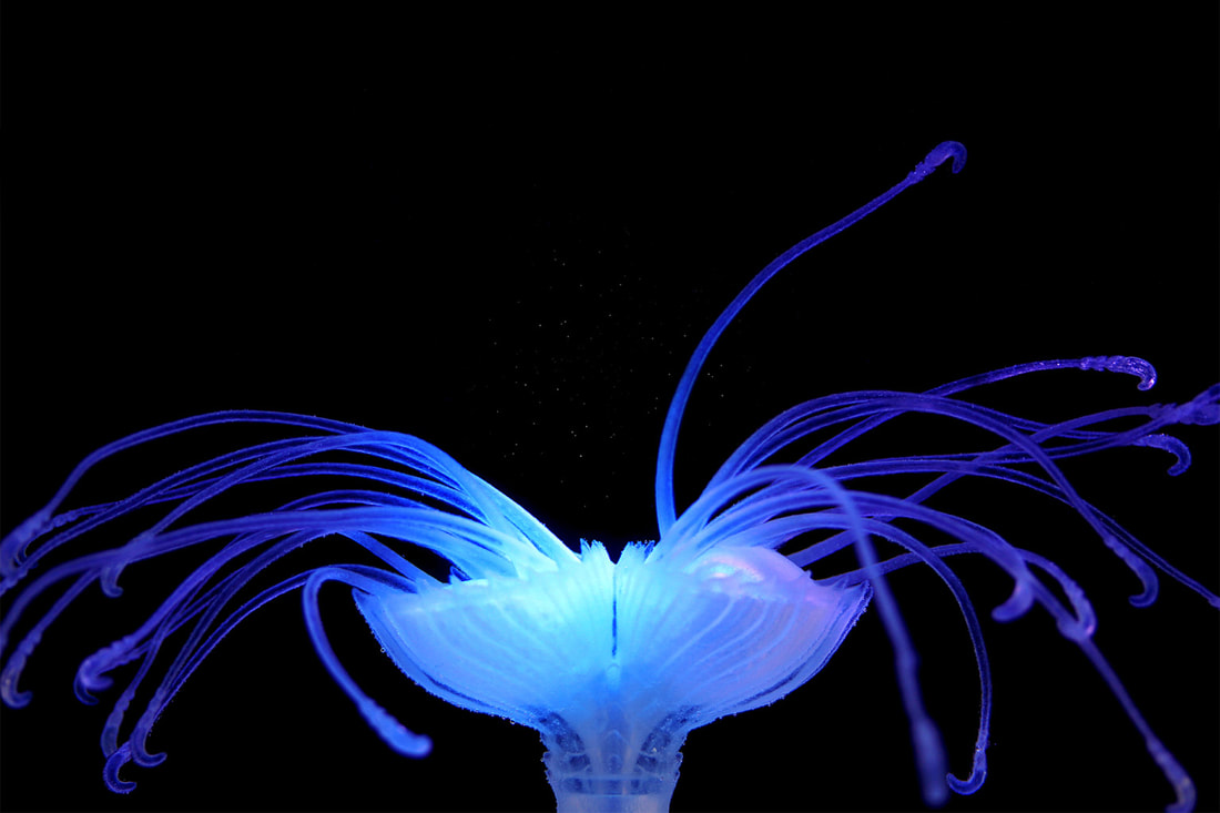
The name of the artist is Nicole Hone. She uses software and multi-material 3D printing. Nicole got her Master of Design Innovation at Victoria University of Wellington. What led to her Hydrophytes piece was she was interested in developing a "future-focused exhibition" where visitors could interact in the National Aquarium in New Zealand. What drew me into her artwork was how each picture of the different aquatic plants were made with vivid and dramatic colors. It made them stand out against the black background. She also was able to make some of them move, which was intriguing because it looked so realistic. Another thing that made her artwork intriguing to me is the fact that I love science and she did her artwork on botany and marine life, which I thought was cool.
https://www.nicolehone.com/ |