|
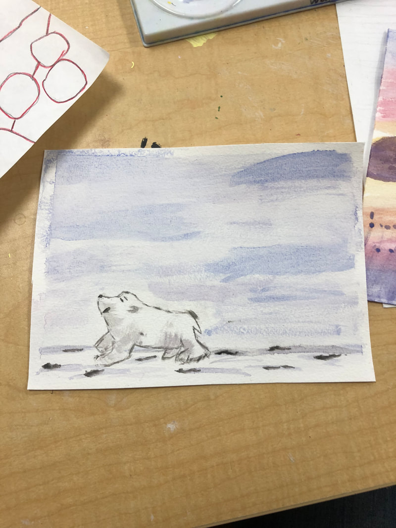
1. Art Criticism Process a. Describe the artwork. List what you see in the artwork. What images do you see? How would you describe it over the phone. Which art elements? Describe the color schemes. b. Analyze the artwork. List art elements and design principles. Color, value, line, shape/form, texture, space. Balance, emphasis, harmony, variety, movement/rhythm, proportion. c. Interpret the artwork. What is the mood? What feeling is communicated? What ideas are represented? What is the story being told? d. Judge the artwork. What do you think of the artwork? Is it successful? Why or why not? Support your opinions with evidence or criteria. (Art skills, meaning, creative, realistic) 2. Critique In the artwork I see a cat. It has large thick dark stripes on one of it's arm and on its stomach. It also has dark thinner lines on the cat's forehead. The face and the chest of the cat have fewer lines making it look light grey to white. Whereas, the stomach and arms have more condense lines making the cat look grey. The thin short and long strokes on the cat make it look furry or look of hair. The movement on the stomach of the cat looks harsh and more free strokes. Whereas, the face of the cat has more small dots and precise lines. The blending of the dark stripes of the cat on the body transition well into the medium and light shades of the body. The body of the cat and the arms of the cat could be better proportioned with the head of the cat. The mood is of a happy house cat. That just woke up from it's 12 hour nap and is looking at her owner who just came into the house. I think the artwork was somewhat successful. There was obviously a lot of time taken, because it looks realistic with all the fine details of the strokes and dots of the pen. The shading around the face into the body was well thought out. However, to make it even more realistic or to better the piece even more would to proportion the rest of the body to the face better. The body is too big, and the arms are too small and skinny. Pick 3 Questions: 1. Art is imagination in motion. Taking something from the brain and it into something tangible; something that can be questioned, lobed, hated, moving, and easily remembered or forgotten. It is an alternative world, one we create that stands in contrast to the world we regularly live in. Art is the best of our imaginings. 4. Artist create art to express feelings and emotions. They use colors, lines, and other elements of art and principles of design to create feelings, such as happiness. Artist might also create art to communicate ideas, such as in politically, spiritually, or philosophically. Another reason is to create a sense of beauty, or to explore the nature of perception. Artist might create art to reinforce culture or traditions, such as their beliefs, environment, where they live, or their traditions. Artist might make some type of jewelry to reflect culture and fashion trends. They also create art to tell a story. I think overall artist's create art to express their imagination. 18. I enjoyed working with the linocut printmaking. I got to plan out how I was going to cut into the rubber, and I liked that because I like to plan ahead. I thought it was cool how you could make each cut as precise and as deep as you wanted it to be. I also enjoyed the fact I could choose any color I wanted to print it and the color of the paper to print it on to. I would wish we could explore how to create mosaics. I think those are cool, because you have to plan out how to make a picture with different small pieces of colored glass, stone, etc. 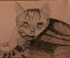 Critique Picture 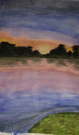 Question #1 Picture 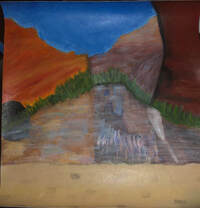 Question #4 Picture 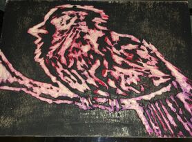 Question #18 Picture
0 Comments
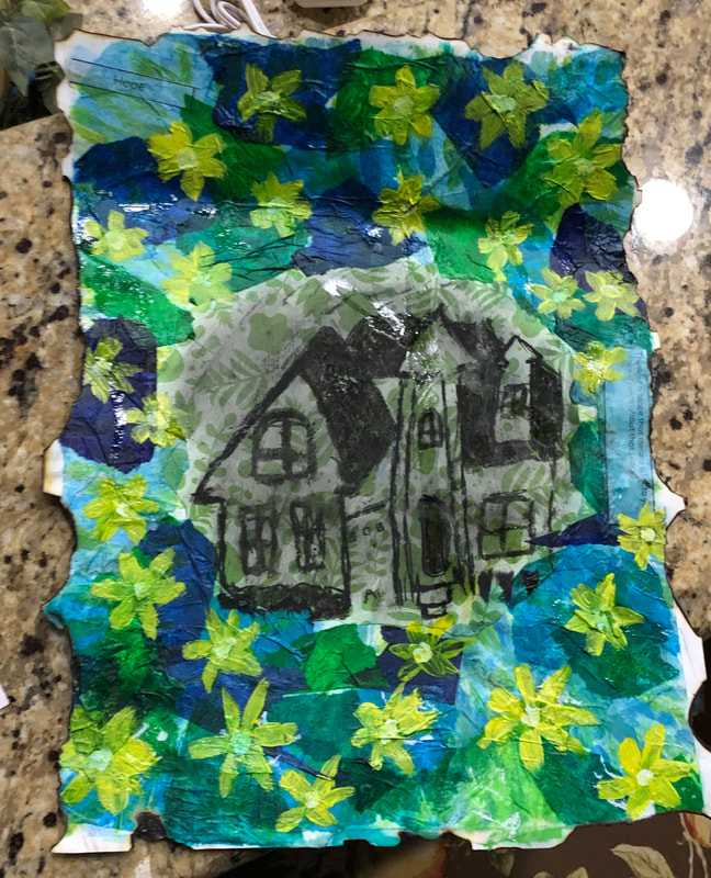
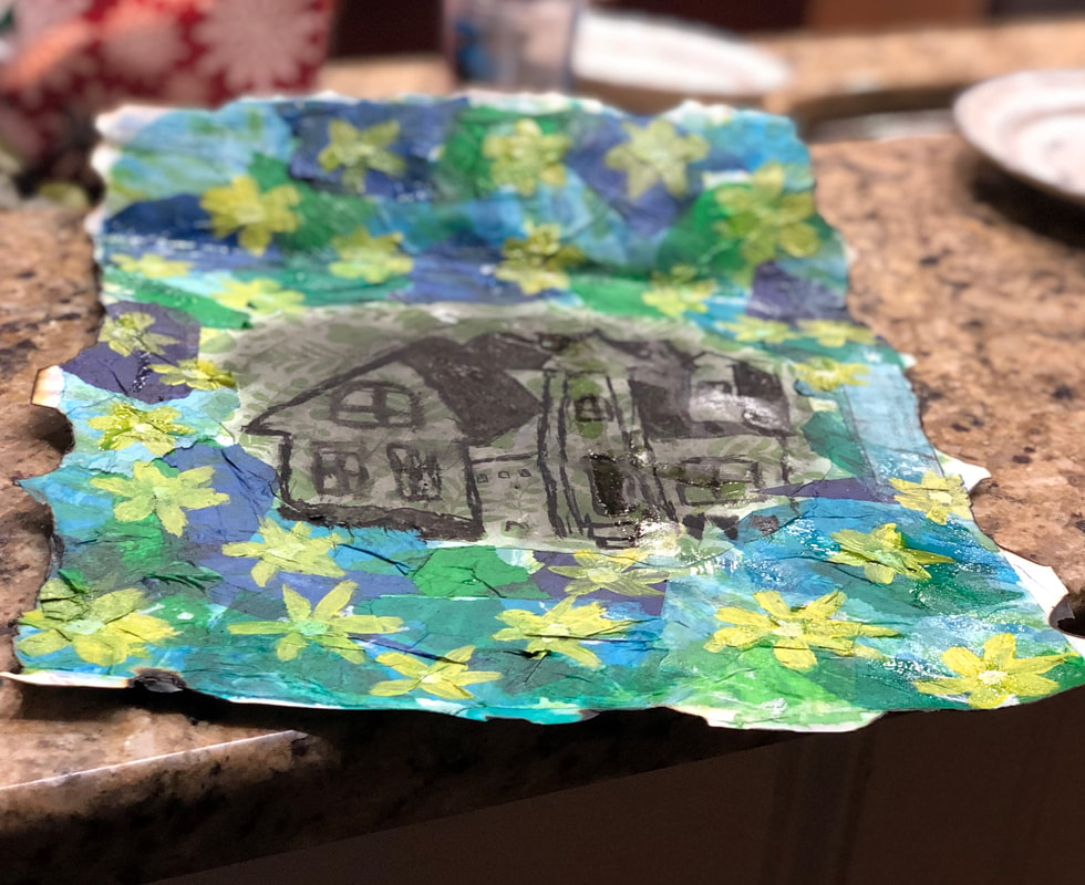
1. I first started by mod podging my themes. I then ripped up tissue paper of different shades of blue and green, and mod podged it over my whole paper, but left the middle blank. I then cut a piece of green scraping paper with leaves in a circle then I mod podged it onto the paper. I think took black charcoal and drew my house on the scraping paper. Next I painted yellow irises onto the tissue paper all over the piece. Finally I burned the edges of the piece.
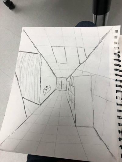
2. My themes were "hope" and "think of a place that means a lot to you". I portrayed it by using tissue paper of colors green and blue, because those colors represent hope. I also painted yellow irises, because those type of flowers represent hope. To portray "think of a place that means a lot of you" I drew my house with charcoal, because my family and my house means a lot to me. 3. I think being able to come up with multiple layers for the project went well. If I do this project again I would maybe use stitching technique and stamping. 1. I used 1-point perspective, because everything is focuses on the sun in the painting.
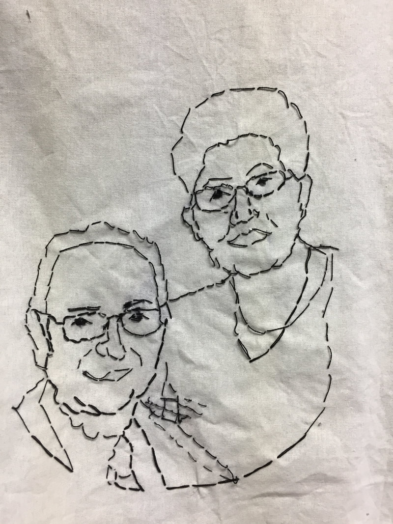
2. 1. I did a portrait of my grandparents. The relationship I have to them is that they are family and my grandparents.
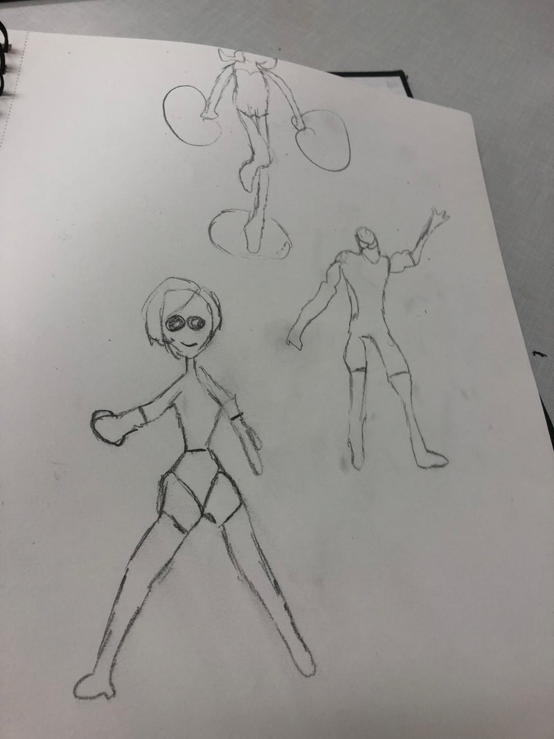
2. I used fabric and stitching. 3. I printed the picture out and traced the main features of their faces on the picture. I then put the picture on the cloth and stitched their faces onto it. I would start from the back and come through to the front and stitch back down. I would then skip a space then stitch back. I repeated this process until all the major features I marked were covered. Finally, to get the paper off I wetted the paper and slowly teared it off. 4. I found that I was able to stitch it well on one person well, however when I needed to go over to the other side some of the strings would get caught. Also, every time I ran out of string I would tie it off and start new string. If I did this again I might do double stitching, so when the paper comes off it doesn't pull on the strings as much. 1. Skeleton cartoon was the most useful, because in skeleton cartoon you do the main features and the outline of the figure. For my piece I did stitching of a portrait of my grandparents. During this I stitched the main features of them.
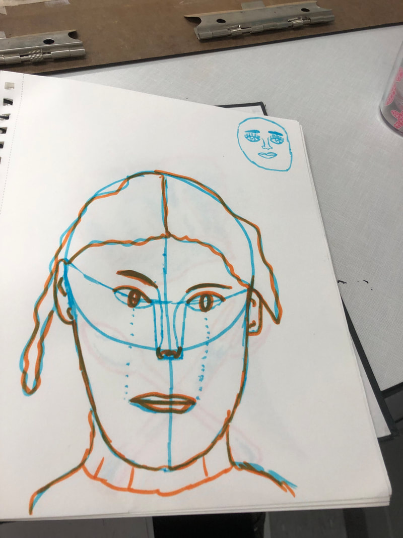
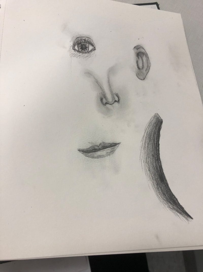
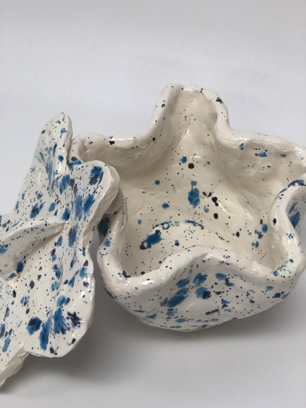
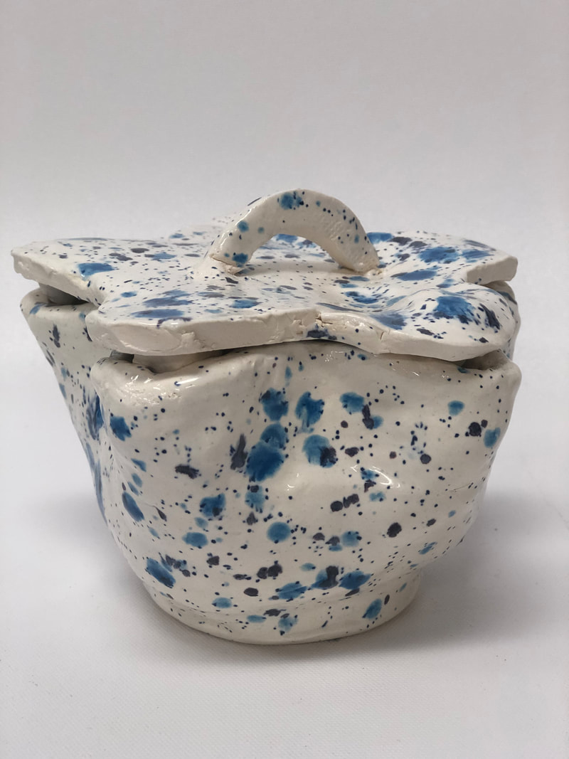
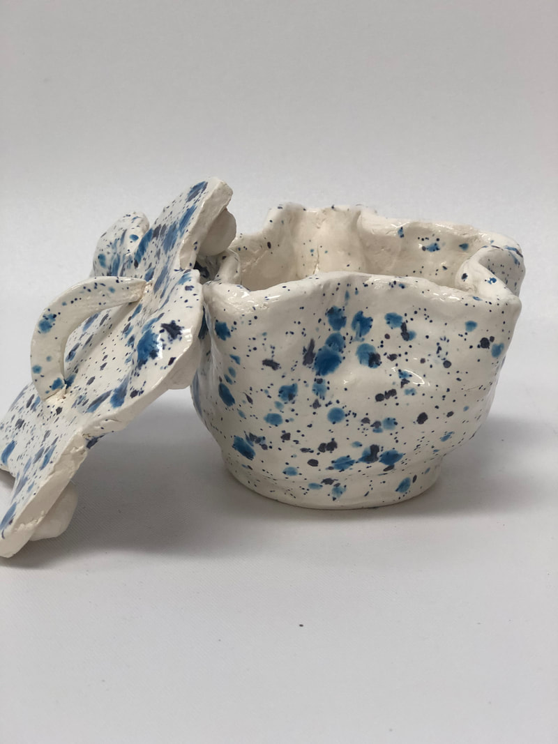
2. I found the most surprising thing about the facial proportions was that the eyes are not as far up on the forehead as you would think. When learning how to set proportions on the face the eyes were low on the face and the forehead was big, and that was because there is going to be hair there. 1. After completing the in-process blog post I fired my piece. Then I glazed my piece with a blue spotted paint. I then fired it once more. After it was finished my pottery looked like a stary night.
2. I found the most successful part of my finished piece was the glazing and firing. 3. If I could change anything about my piece I would measure the star lid to fit better onto the pot. 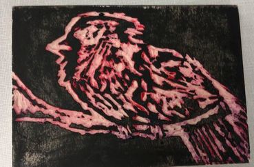
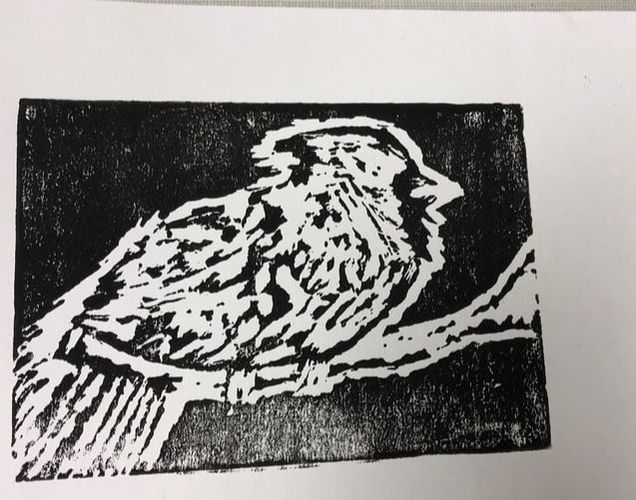
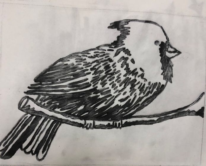
1. My piece shows the theme of "line" because my piece consist of multiple lines.
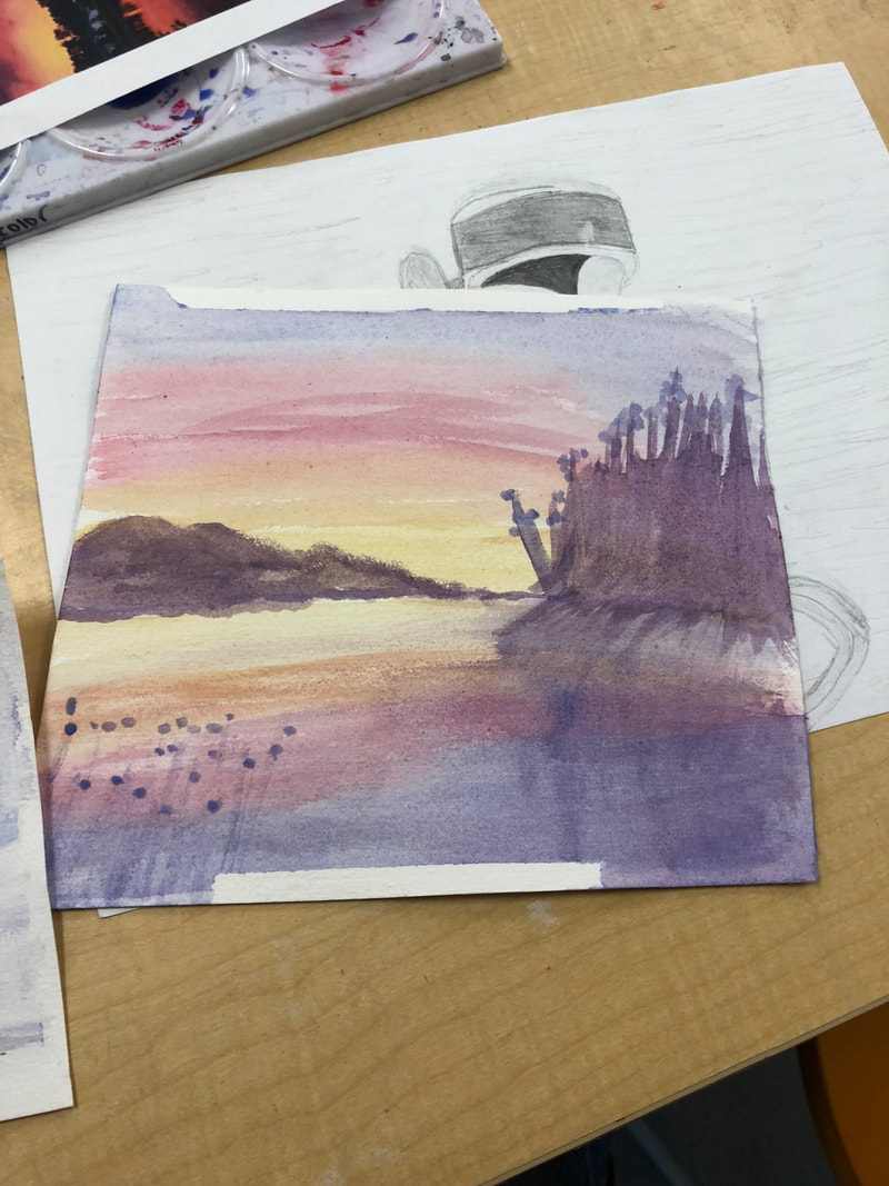
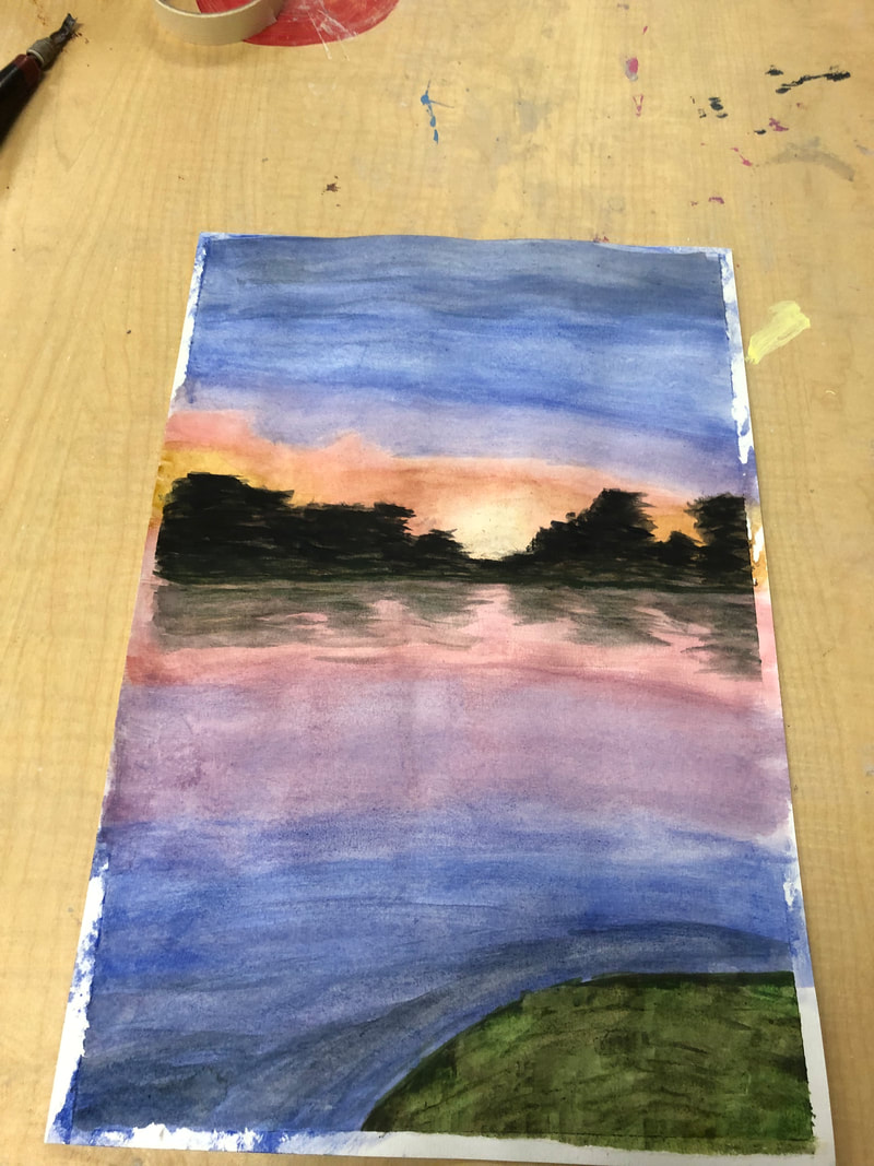
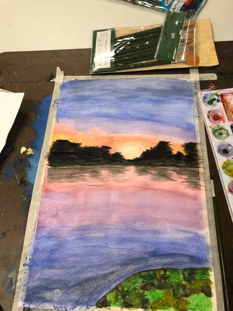
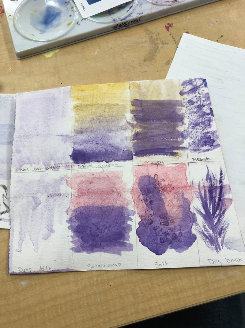
2. My piece is semi successful, because it looks like a bird. However, I would change some of my cuts on the pieces. For example, the shadow on the branch I cut too much off. Also, I feel I should have kept the eye just a black circle and then cut around it. 1. I found the sunset painting most helpful, because for my watercolor painting I have a sunset with pond. So, it helped me learn what to do and what not to do.
2. I like how there are different techniques of watercolor you can do. Like if you let salt dry on the wet paint it makes a cool pattern. 3. I find waiting for the paint to dry is the most difficult. Also, if you make a mistake you can't paint over like acrylic.
|